How to build a mobile first and responsive website from scratch in html and css.

For Developers
If you’re going to build a website now a days, your number one focus should be making sure it’s responsive and adaptable to all screen sizes. This is because Google has made announcements that all websites that are responsive will rank better because of better load times, better usability, and will be preferred in mobile searches. So a website that loads fast and looks good in all mobile screens will have an advantage over a website that is not built responsively. And if we’re going to talk about mobile responsiveness, we also need to talk about mobile first programming, in which you build your html and css with mobile screens in mind first. Responsive design and mobile first programming go hand in hand, so in order to make the most of your website, it should be done mobile first, and completely responsive.
This article is for developers looking to understand how the heck you make responsive websites in the first place and has all the answers I wish I knew when I was starting out. So let’s get started!
Starting Mobile First
Before you even think of making a responsive website you need to understand how to make a mobile first website. It’s a key skill in today’s web dev world and in my opinion THE best way to make a website and it actually makes it easier.
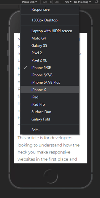
The whole idea is to structure your html and css with mobile phone in mind first. When you have your html done, open it in in the browser and inspect element, and choose the iPhone 5SE screen option. It’s the smallest mobile screen size you’ll encounter at 320px wide. This will be your canvas instead of the wide-open full desktop view. That will be last! We’re starting mobile first here, and this is where it begins. I like to zoom in 75% so it’s not so small. This is the screen size you will be writing your css to fit in. No media queries required. Just write the code that makes everything fit in this screen size. That’s the beginning of mobile first programming!
Structuring your css for mobile first
In mobile first, we start the top of your css file with the mobile code, then add media queries for bigger screen sizes as we go down the page. The most common breakpoints to use are:
- 400px - Large Phones
- 568px - Landscape Mobile
- 768px - Tablet
- 1024px - Small Desktop (Laptops)
- 1300px - Normal Desktop
- And any other breakpoint you may need to fit the rest of your design
These are the standards I work with and sometimes you add media queries in-between to make sure some special elements fit. I like to start writing css to fit in 320px screens then add a media query for a 400px min-width and make size adjustments for the larger phones where needed, like increasing font sizes, icon sizes, etc. I start at 320px because that’s the smallest possible screen you’ll encounter, so if you want to be fully responsive, we need to take them into consideration and then add a new media query for the larger phones and tailor the site to them as well for the best user experience and design.
To be truly 100% responsive, set your inspector setting to “responsive”, start at 320px, and drag the edge of the window and make it grow. Wherever anything in the design breaks or looks bad, set a media query for that specific screen size and fix it. Do this all the way up past desktop widths. By doing it this way, your site will fit any and all possible screen sizes and you can say it is 100% responsive.
This is your new working screen. The beginning of your css sheet will start with the code to make your content fit within these borders. This is why it's referred to as "mobile first". Desktop-first would have us coding starting at like 1500px wide and then squeezing down. That's the old way of doing things and you should avoid that wherever you can.
Setting up your media queries
When writing your media queries, I always use min-width. I don’t make a range or a max-width. This is because when you use min-widths, all the styling from the previous media queries still applies to the next step up, and only the new css for that screen size gets loaded on top of what came before it. This prevents you having to repeat code or redo sections over and over. They just keep carrying over to the next screen size where it gets edited. Every step up should bring you closer and closer to the desktop version of the site. You don’t just make the desktop design from scratch, you’re building up to it so when you do get to that point, all the heavy lifting was already loaded in from mobile, all that’s left is some extra resizing or tweaking to top it off and making your desktop nav and final footer design.
That’s the beauty of mobile first. Instead of starting at the desktop size and squeezing everything down or rewriting some portions as you get smaller, you start small and add to it step by step building on the code you wrote previously rather than tearing it down. This pairs perfectly with responsive design because it’s easier to make things grow into their containers rather then stuffing them in and squeezing them in. So we should achieve 100% responsive designs with less work, less bugs, and less headache. That is why I started talking about mobile first “first”. It makes responsive design so much easier to do when done this way. So with that, let’s see HOW we can make them responsive without much work or having 50 media queries.
How to make responsive websites
When trying to make responsive websites, it’s important to get the html structure down first and use semantic html. I use the same structure for all of my sites, which is to break the design up into sections, each living in their own section tag, and inside that have their own .container div, and inside of that have the content. Like so:
The section tag helps tell google and screen readers that this section is different from the others around it. They are self contained and all the information inside of them are relevant and related to the sections purpose. It’s better this way, because if we’re making them all divs it can make things look a little messy and difficult for Google's web crawlers to group information together and not just understand what the content is, but also what it MEANS in context to the stuff around it.
I like to put individual containers inside each section because not every section might have the same width. I’ve seen many websites with a container class wrapping the whole website and everything just stays within that width. It’s boring. And it limits what you can create. By having individual containers you have more control on what can be done in those sections and aren’t confined to the same width as the rest of the page.
Setting up your containers
I like to have a global css sheet that is used on all pages so those styles can be changed once and they change on all pages, like header and footer code, core page styles like fonts and colors and buttons, and how all containers behave.
While we have individual containers in each section, we still want to have some styles that they all share in common so they behave the same way. Here’s what I use on all of them to start at 320px:
WHY: I set the container to width 100% so that it will grow with the screen size. It is 100% the width of the screen size. That’s how you make them grow - by using percentages as widths. Then set margin to “auto”. When you set it to auto, it “automatically” calculates the left and right margin to make the container centered horizontally in the screen. Any element with display set to block and margin set to auto will always be centered horizontally in its container or the browser window. So when the container stops growing at whatever max-width pixel you set it to, it stays centered in the screen. Then set the padding to padding: 0 10px to add padding to the left and right. Padding adds space INSIDE an element, while margin adds space around it. By adding padding to the left and right of your containers it gives that 10px buffer between the content inside of it and the edge of the screen. While you want your container to be 100% the width of the screen edge to edge, you don’t want your content 100% touching edge to edge. It doesn’t look good. So by adding that space INSIDE the container to “pad” the left and right sides you are creating a little bumper for your content to sit against instead of the screen.
In this image, when we hover the over a container in the inspector, we see the green bars to the right and left. That's your padding.
Circling back, the max-width tells it at what pixel width to stop growing. The best “quick” way to maintain consistent design for all those weird screen sizes between mobile and tablet is to set your containers to have a max width of like 450px which is just a little bigger than the largest phone screen. That way, between 450px and 568px (landscape mode on phones) the containers stay 450px and the design doesn’t “grow” anymore than that. The elements inside those containers stay where they are. The only drawback is that the content will have a bunch of space on the left and right and might not look the best. But this is the quick and dirty way to make it fully responsive. What I actually advise doing is add extra media queries and change the design and size of your elements inside the containers to fill up the screen at all possible sizes - if you have the time to put in the effort. It can get a little time consuming doing it the long way, but the overall quality of look of the product will be so much better. Just do what I mentioned earlier and increase the size of the browser window and where the design breaks anywhere on the page, set a media query for that size and fix it, and so on.
So if you want to be truly responsive, set a max-width on your container to 1000px, which will be the perfect size for when you get to the 1024px size section of your css. Then when you get higher you can change the max-width to whatever it needs to be for the different sections. There's no "one width to rule them all", it's all entirely dependent on your design and can be different for multiple sections and media query sizes. That's ok!
Overall, this is the basic template you need to get yourself used to doing in order to begin using mobile first responsive design in your websites. You have your section with a container class inside of it, and the section content inside that container. The container is set to 100% width and a max width at which you want it to stop growing to, and margin auto will keep it centered, while the padding on the left and right will keep the content from touching the edges of the screen. That is the basic building block of responsive design and will be a method in which you will utilize A LOT, so it’s important to really commit this pattern to muscle memory. You can also set your content at width:100% as well so it can grow with the size of its container. Just make sure to check the page design as you increase the width of the screen and see what section break or look off and set a specific media query to target it.
How to plan your html for mobile first
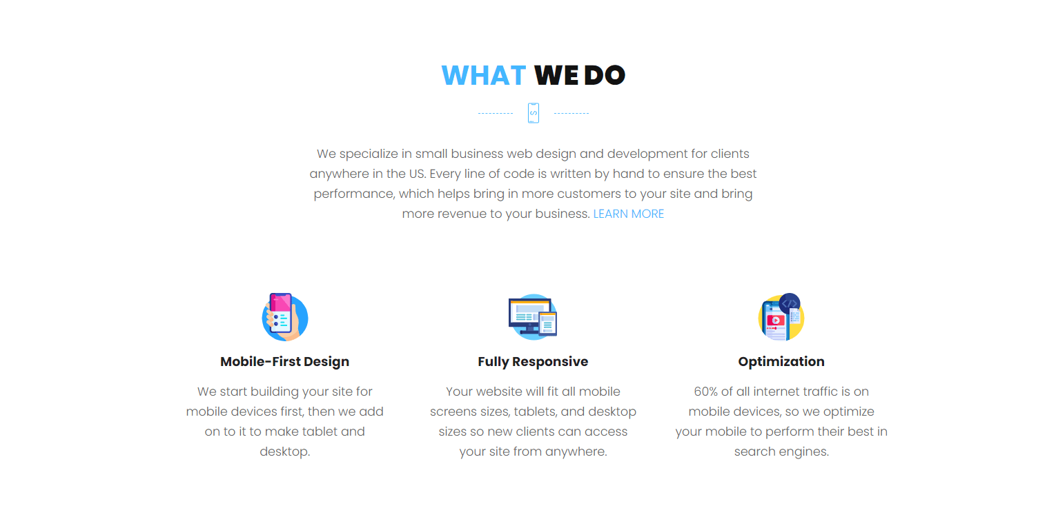
Now for the fun part! When you're given a desktop design, how do you structure your html for the best transition from mobile to desktop? The first thing you need to do is analyze each SECTION individually, and break the design down into it's containers and the pieces inside them. Here's an example design from my website:
Stacking order in html
When writing your html, you have to keep in mind how the elements stack based on the oder in which they appear in the code. If you have three elements, in order from top to bottom, the top element will obviously be first in mobile, and on desktop if they need to be stacked horizontally then it will be on the left side, the middle element will be in the middle and the last one will appear on the right.
It's a simple concept, and one many probably already know, but I wanted to slip this in for those who may have missed this part or needed to know it. When you write your html and structure your elements, keep in mind that going from top to bottom in html will eventually stack left to right when there's enough space.
Block level elements (display:block) appear on their own lines. So starting at the top, with "What We Do", graphics, and paragraph, what's the simplest way to code that using as few divs (if any) as possible? Should you wrap these elements into one container and work with them inside of that?
When I see this, I see the block level elements first that can be on their own line with no one next to them, such as the heading and paragraph. I can set those to display:block and text-align:center. This will center them with or without a container around them, great! But the group of graphics looks like it HAS to be in a separate container so we can use Flexbox to work specifically on them and center them. So for that section looks like we just need the one container div to group the graphics together so they can be arranged, the other two can just be block level elements and will scale just fine going from mobile to desktop because they will essentially be in the same exact spots behaving the exact same way.
Now for the group of three mini "cards" that are centered horizontally. Because they are next to each other, we can't get away with making them all block level, since they need to be in a line together (display:inline-block), and not by themselves. So we can add a div around them with a class of "wrapper" so that we can arrange them within that container without affecting the rest of the section above it. And within that container looks like each "card" needs to have a container around it too, lets call it "item", and each element inside of that can be block level elements since they are all on their own line by themselves. So it looks like that's where we can stop adding containers.
I know that's a lot to take in on text, so here's a graphic showing how we grouped everything together visually to plan their css positioning and arrangement:
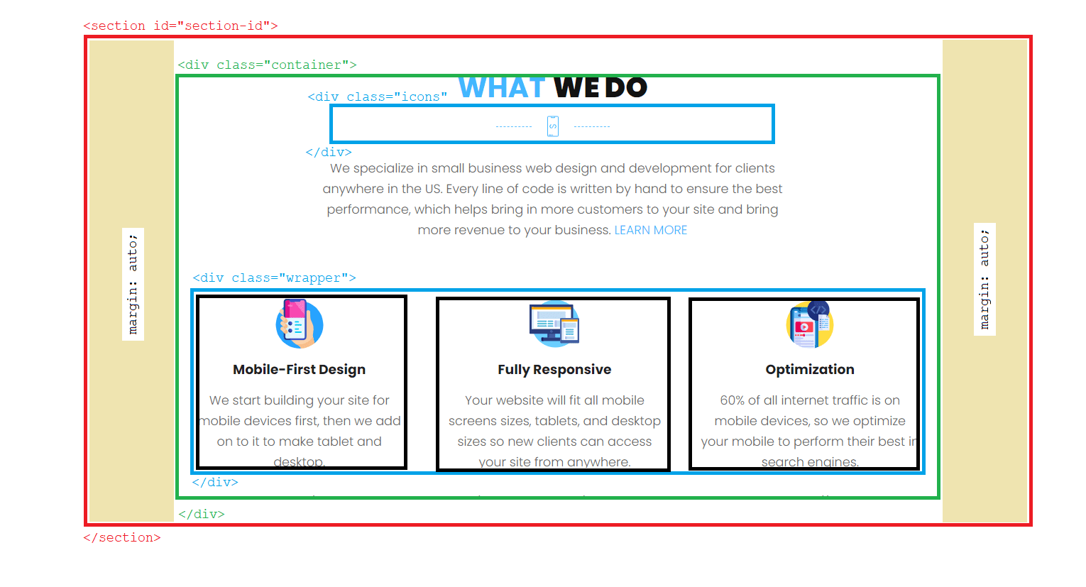
It might be small to see if you're on mobile, but the red box is your section tags, and inside that is your container (green box), and the blue boxes are the additional content containers we have to use in order to arrange those items without messing up the other elements. We "contain" them so they can be manipulated separately from the rest of the section. The orange boxes on the left and right side of your container are your margin:auto centering the container inside the section tags. The black boxes are the "item" containers we use to wrap each individual group to contain the content. The elements inside of them can all be set to display:block, text-align:center, margin:auto to center them vertically and horizontally in the .item container.
Here is how the mobile version should look like with the given html structure and natural stacking of the html elements:
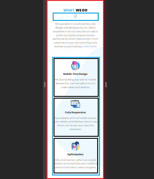
You can start to "SEE" how mobile can be started by looking at the structure of the desktop design, breaking it down into it's block level elements and it's containers. This is technically the best way to structure the html for this design using the least amount of divs as possible. I say technically because we could even delete the main .container div around everything since it looks like it is not needed to serve as a barrier for elements to nudge up against. I left it in the desktop picture to show how it looks. If we removed the .container class, how do you think the content can stay centered? Divs are block level elements by default, so your .wrapper class around the three .items just needs margin:auto to center itself horizontally within the section tags. Here's how the html should look:
Copy this html and see if you can recreate the layout yourself in your own code editior. I removed the .container from this design because it's not needed, and our goal when writing html is to use as few divs as possible. This will make us write cleaner, better performing, and easier to understand code.
This is how you have to look at designs in order to properly plan how they will look and behave going from mobile to desktop, and is the first thing you should do before writing any code. You need to analyze the indivudal sections and plan out your html structure based on what can be block level elements and what needs containers. Figuring out HOW you are going to group the elements will help you see how the puzzle pieces can arrange themselves from mobile to desktop.
You'll also notice the use of aria-hidden="true", this is an Aria Attribute that tells screen readers to ignore this element since it's not important. We use this for anything that is used purely for design and has no importance to understanding the content on the site. So basically all icons would have this attribute on them since they are just for show and add nothing to the readers understanding of what they are reading. To learn more about web accessibility and using proper Aria Attributes, visit www.w3.org to learn about them and when to use them. This is something you'll need to use alot when writing your html. Always keep them in mind!
So if we were to code this mobile first, we'd start at the top. I'm going to use an old school way of centering content without Flexbox on this one to show another way of doing things. When you have inline-block elements inside a container, if you add text-align:center on the container, all the inline blocks will now be centered inside the container. vertical-align:middle centers inline-block elements vertically inside their containers. It's a neat little property I used every once in a while.
We can then create space between the images by adding margin to the left and right of each image with margin:0 10px. This adds 0 margin top and bottom and 10px margin left and right. This is a very quick and easy way to center and space elements inside a container using the inline-block property. You can also use text-align: left or right and it will push all the elements to the left or the right of the container. Here's what it should look like:
I added the width:100% and max-width:600px to the p tag because I want it to grow wider with the screen and stop at 600px, which is how wide it will eventually get on desktop. So when we get to tablet, it will already be at it's desktop size and won't have to touch it when we get to desktop. Less work! It also has a padding left and right of 10px since we aren't using the container anymore. It will needs something to keep it from touching the edges of the screen so when we have elements without a main container to push up against we can just add the padding left and right that would have been there with the container.
As for the css on how you would arrange and center the 3 cards, I highly reccomend learning how to use flexbox from Flexbox Froggy and practice using it. I won't go into flexbox here because this article is already long enough... But to do it without Flexbox, use the same inline-block technique I used on the images. It will do the same job.
But! I won't leave you hanging on what code to use, so for the .wrapper container, here's the code you'd write on desktop:
.item class on mobile:
This will center the items and stack them vertically, and allow them to grow with the screen size only stopping at 350px wide while still being centered.
These items will stay this way all the way through tablet. So when you get to that screen size there's nothing you need to do!
.wrapper class on desktop:
When you get to desktop the above code is what you need to use. Flexbox and CSS Grid are the fundamental tools for creating responsive websites. I use Flexbox all over my site. With just a few lines of code you can completely rearrange the stacking and placements of the elements inside of the flex containers. After reading this article, I highly suggest learning and practicing with Flexbox and Grid.
Wrapping up
Those are all the basics of mobile first responsive programming and how to set it up. Hopefully this helps you understand how to set up your css to begin mobile first responsive design. It takes practice and some getting used to, but once you have the formula down and you get really good at breaking down each section's design into their most basic and minimal strutures, this will all come second nature to you and eventually you'll be able to just look at a desktop design and "know" exactly how you're going to build it. This will make you much more efficient in your time, and your code will be written more cleanly and with more purpose which will minimze the amount of bugs and headaches you may run into during the process.